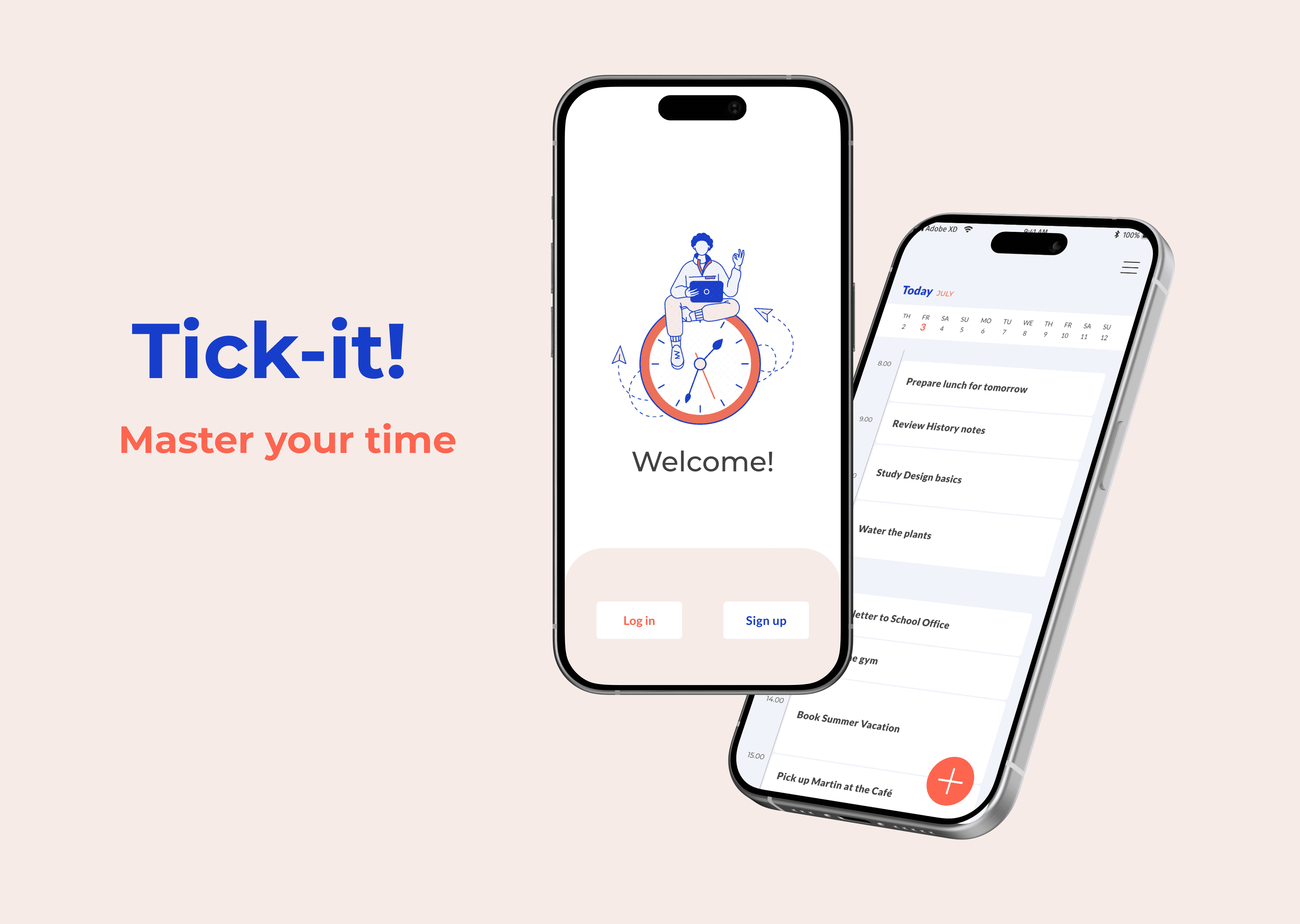
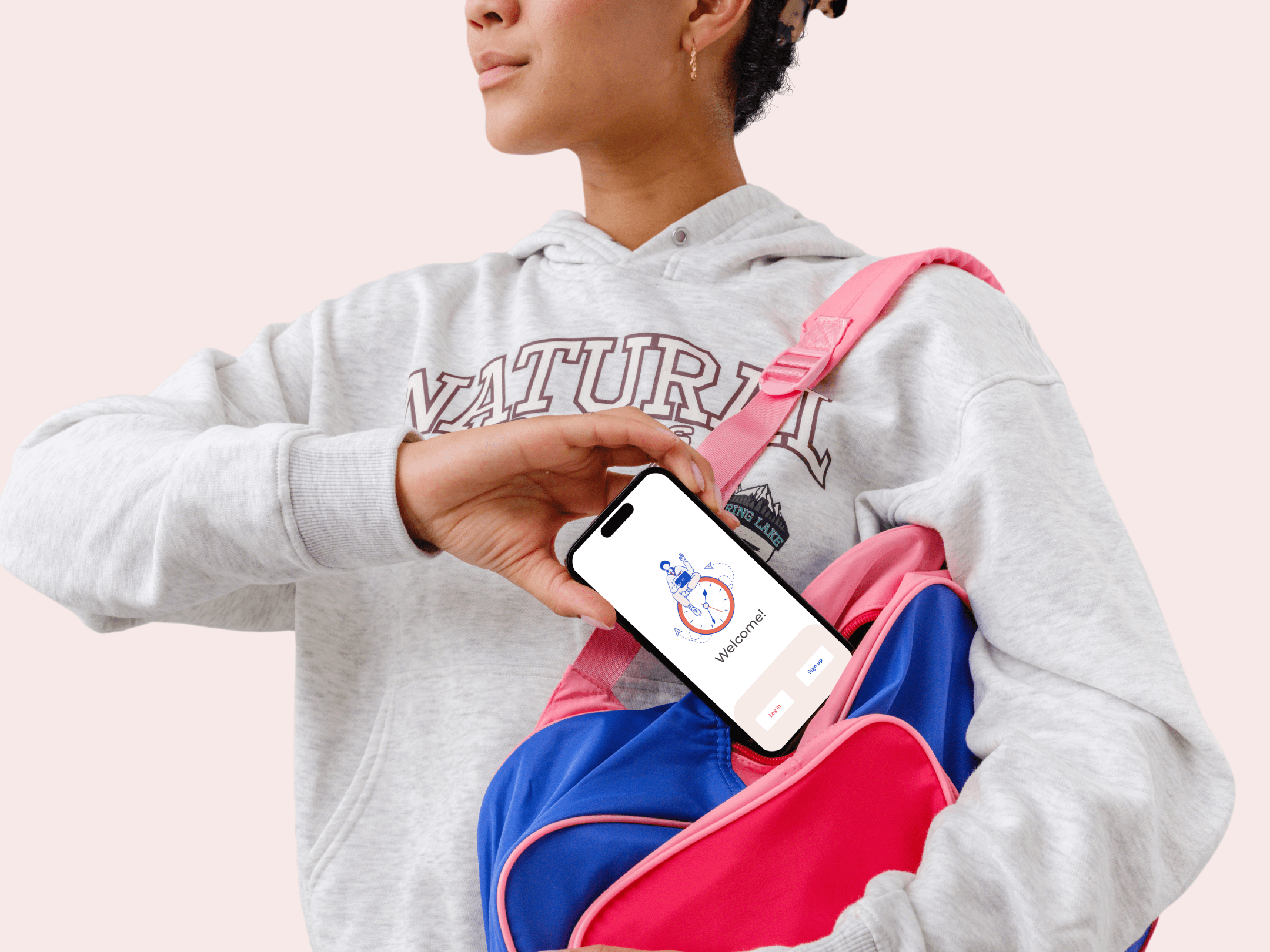
Tick-it !
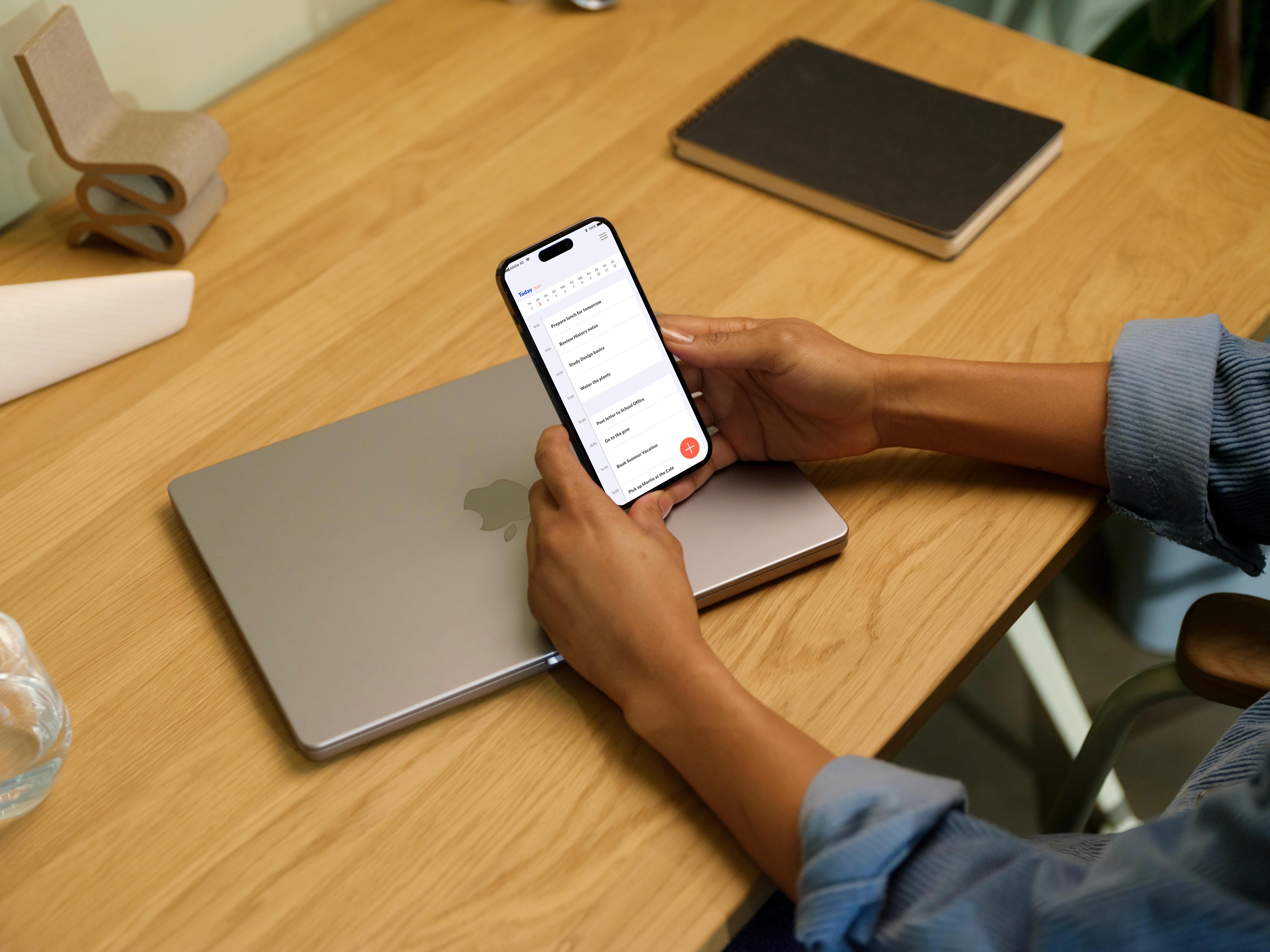
Tick-it ! is a minimalist productivity app for the 16-24 years old.
Tick-it !
Tick-it ! is a minimalist productivity app for the 16-24 years old.
Tick-it !
Tick-it ! is a minimalist productivity app for the 16-24 years old.
Role
UI Designer
Role
UI Designer
Role
UI Designer
Type
Web App
Type
Web App
Type
Web App
Duration
June-July 2023
Duration
June-July 2023
Duration
June-July 2023
Tools
Adobe XD, InVision
Tools
Adobe XD, InVision
Tools
Adobe XD, InVision
Context
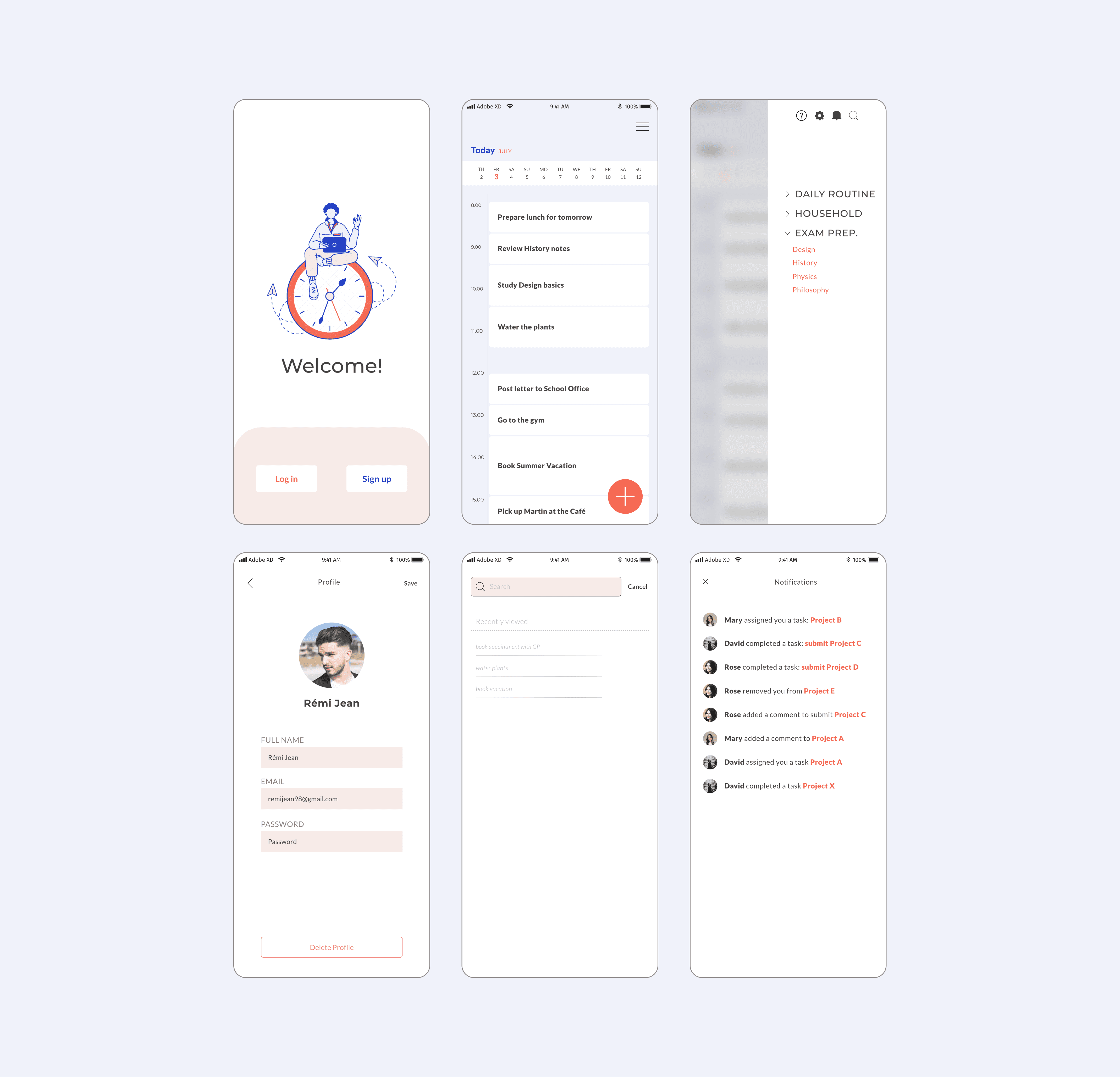
This was my first project for my UI Design course through Career Foundry. I received a brief from the hypothetical founders of a productivity app, asking me to develop 2 to 3 key functionalities and design the UI for their mobile app. I chose to focus on the features "Create a User Profile" and "Create Task List".
Objective
To design the UI for the mobile version of a productivity app and prepare for handover to developers.
Context
This was my first project for my UI Design course through Career Foundry. I received a brief from the hypothetical founders of a productivity app, asking me to develop 2 to 3 key functionalities and design the UI for their mobile app. I chose to focus on the features "Create a User Profile" and "Create Task List".
Objective
To design the UI for the mobile version of a productivity app and prepare for handover to developers.
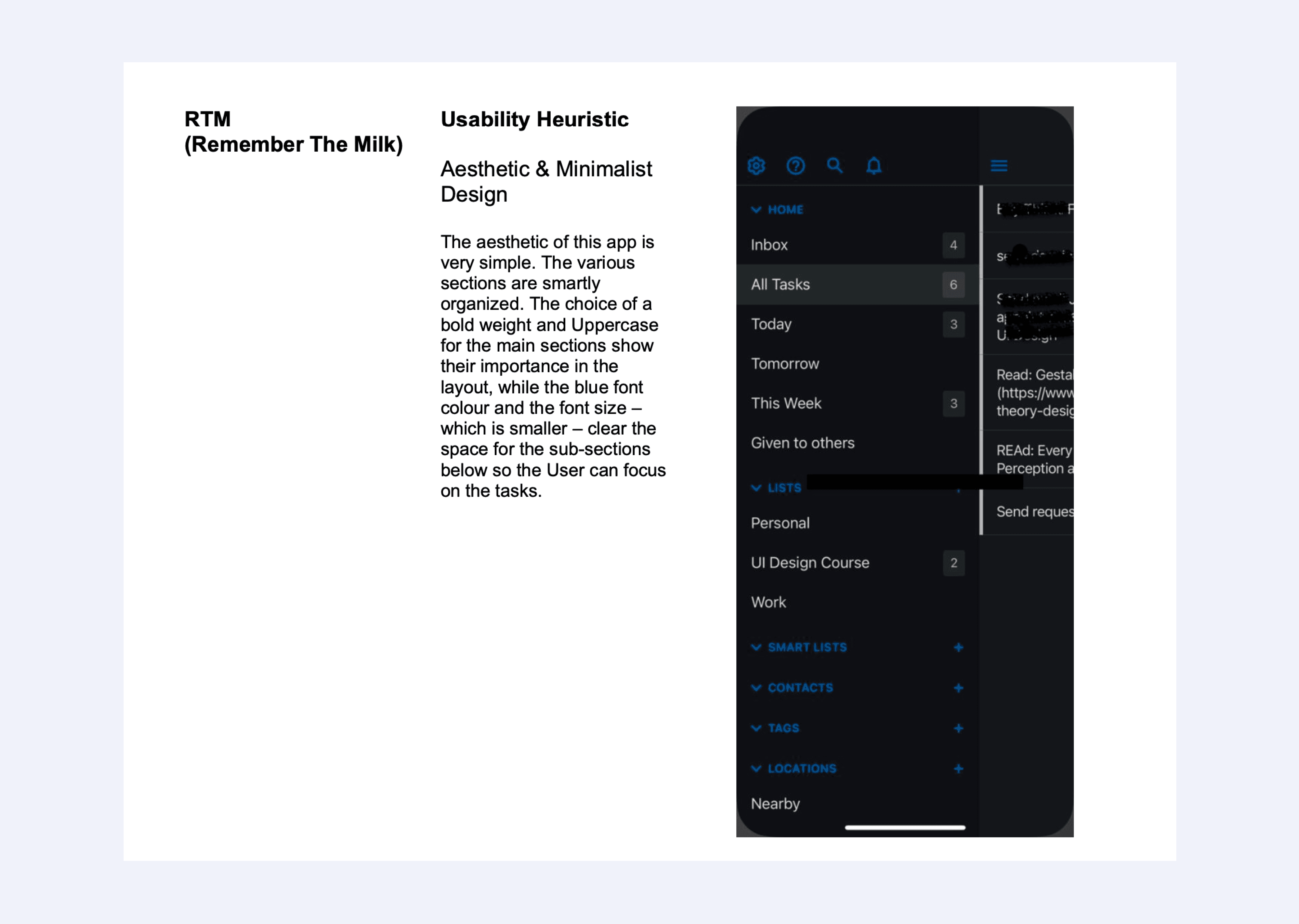
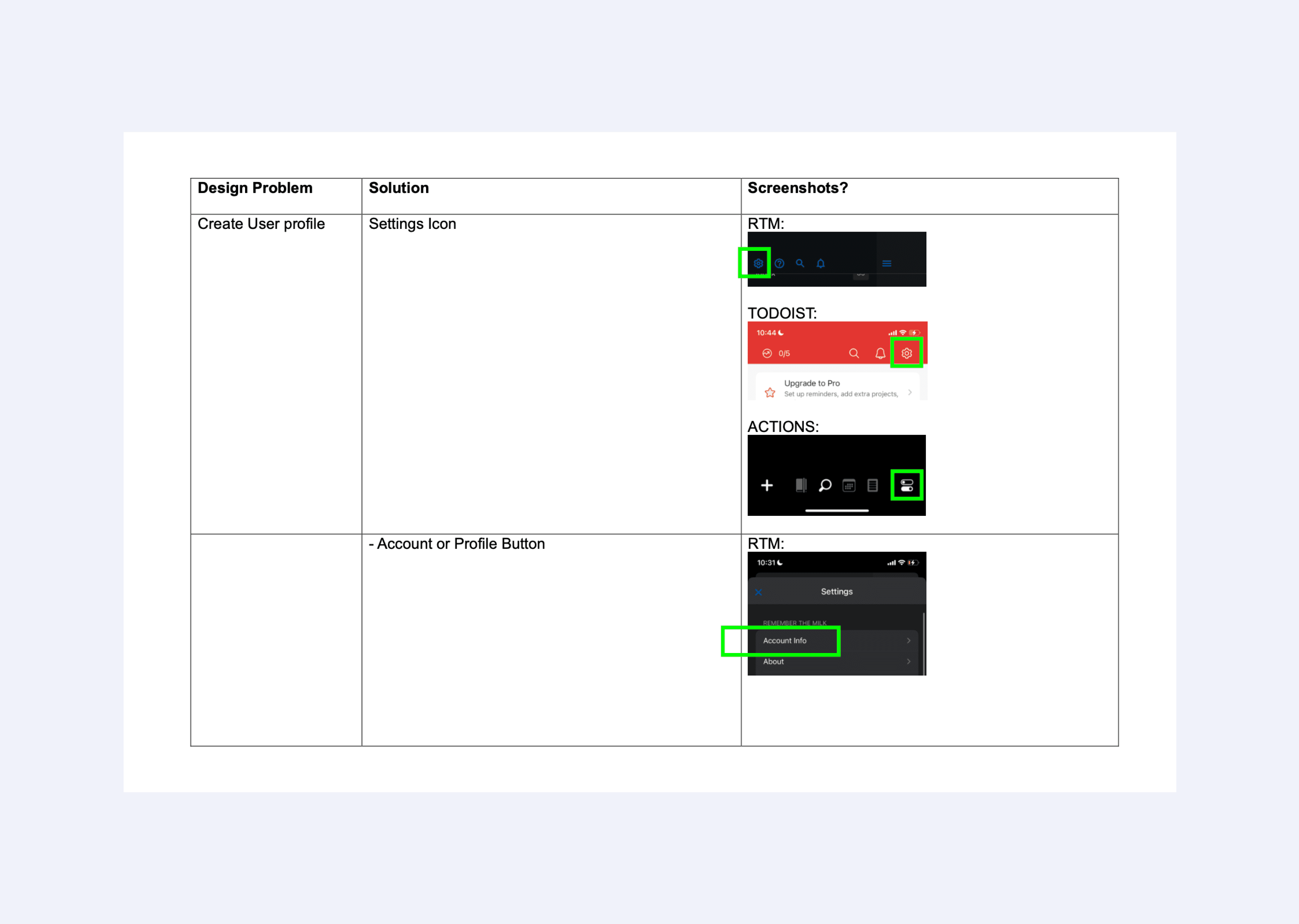
Analyse Competitors
In the brief, it was requested to analyse 2 competitors. I chose RTM, Todoist and added an extra one, Actions. I identified the main usability heuristics applied to each app as well as the category and functionality of design patterns.
Identifying Design problems
At this stage, I identified the design problems associated with the chosen key functionalities and sought solutions by examining the design patterns analyzed during the competitor analysis.
Low-Fidelity Wireframes
Once I had a clear idea of the solutions needed, I sketched the first wireframes.
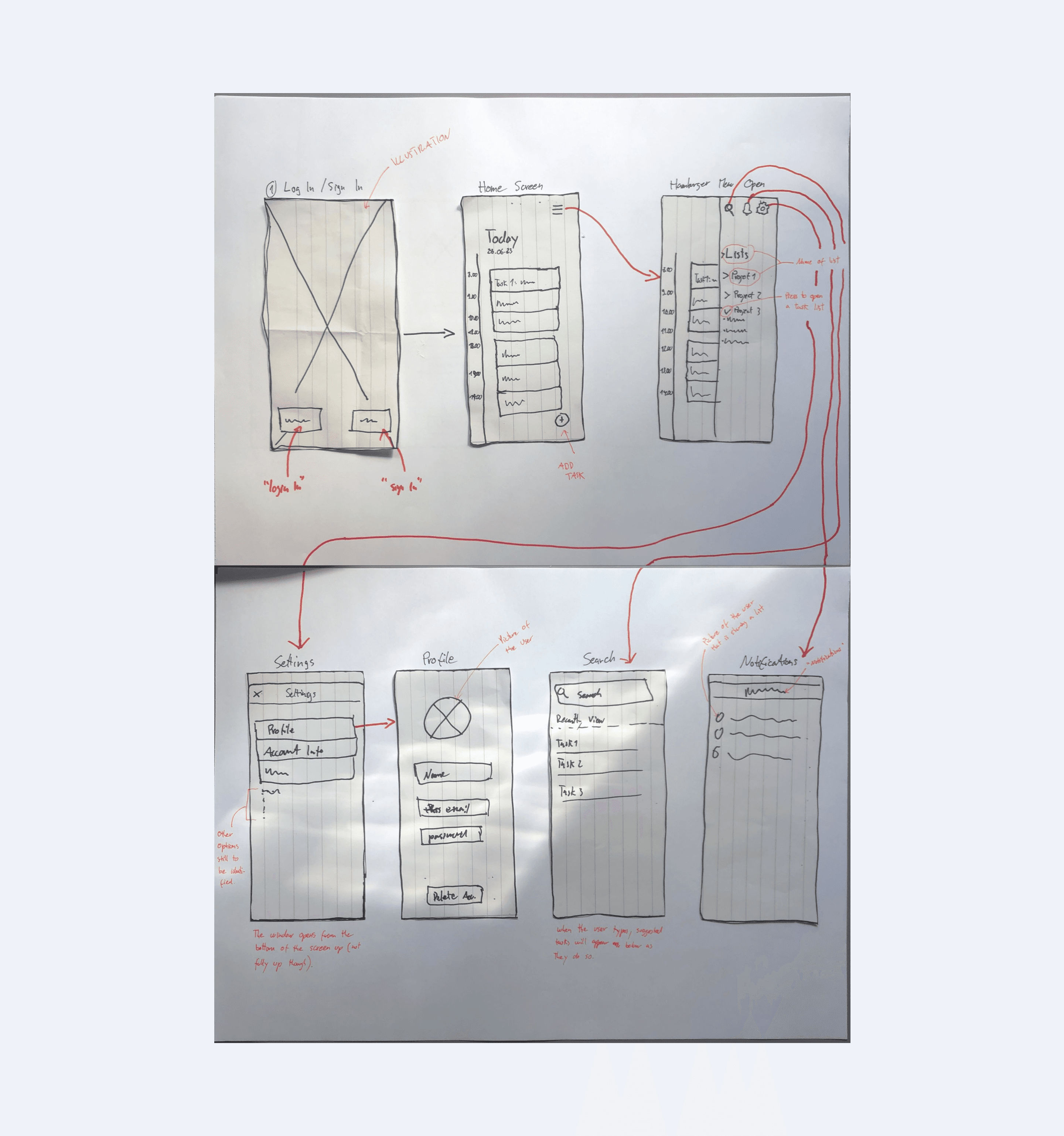
UI Elements and Hierarchy
A reflection on the different hierarchy levels between each element was made and applied to the wireframes. Symbols and Iconography were also selected and applied.
Mid-Fidelity Wireframes
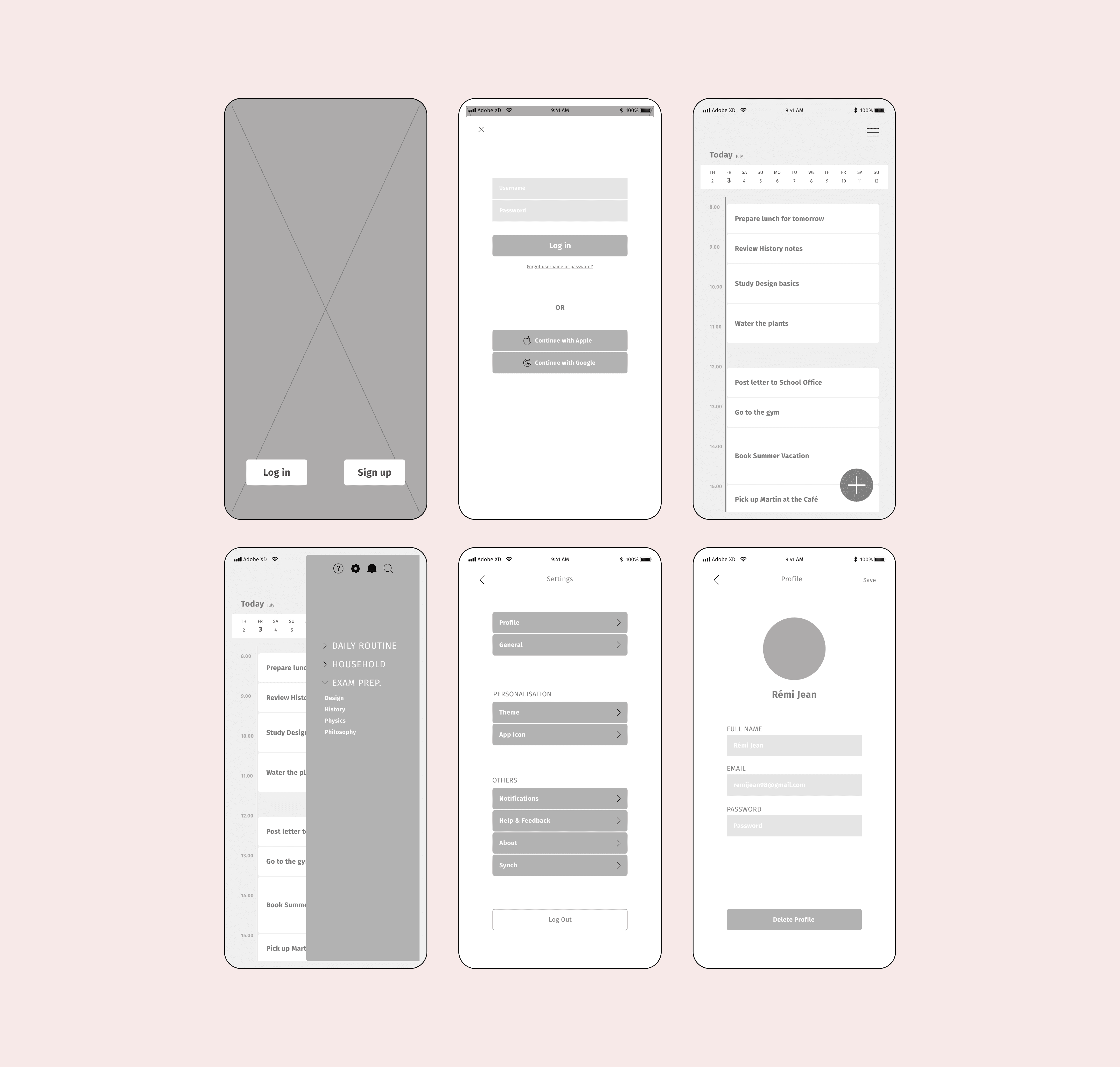
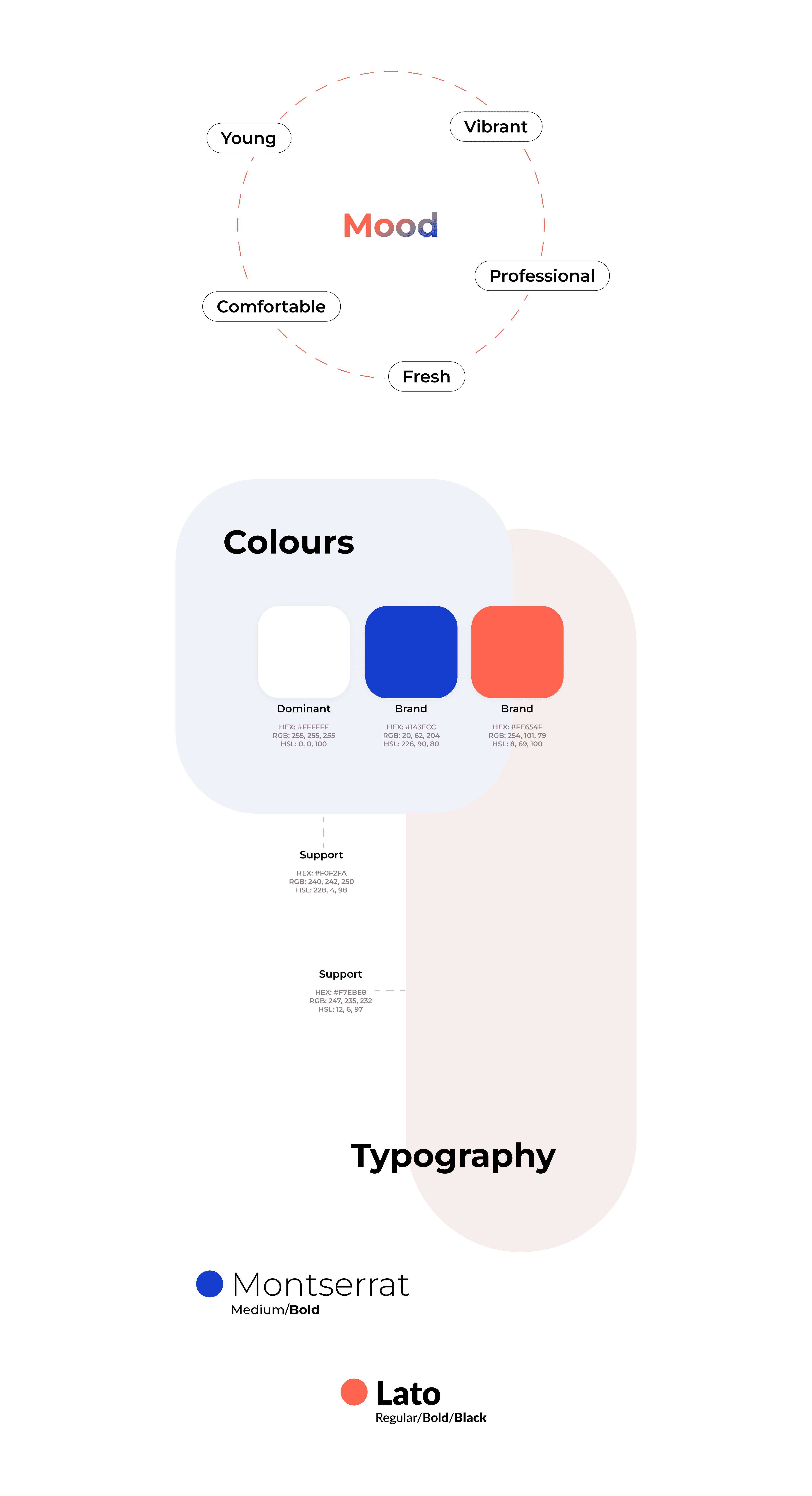
Colour Palette and Typography
The colour palette and font choice were selected to match the targeted audience.
Final Design
Analyse Competitors
In the brief, it was requested to analyse 2 competitors. I chose RTM, Todoist and added an extra one, Actions. I identified the main usability heuristics applied to each app as well as the category and functionality of design patterns.
Identifying Design problems
At this stage, I identified the design problems associated with the chosen key functionalities and sought solutions by examining the design patterns analyzed during the competitor analysis.
Low-Fidelity Wireframes
Once I had a clear idea of the solutions needed, I sketched the first wireframes.
UI Elements and Hierarchy
A reflection on the different hierarchy levels between each element was made and applied to the wireframes. Symbols and Iconography were also selected and applied.
Mid-Fidelity Wireframes
Colour Palette and Typography
The colour palette and font choice were selected to match the targeted audience.
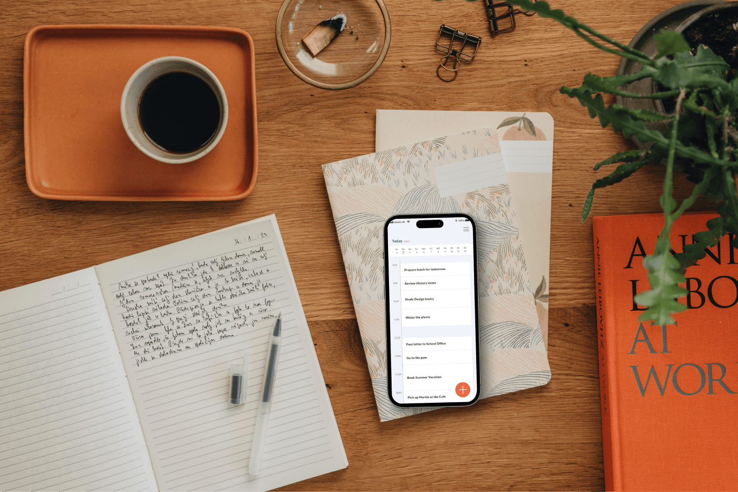
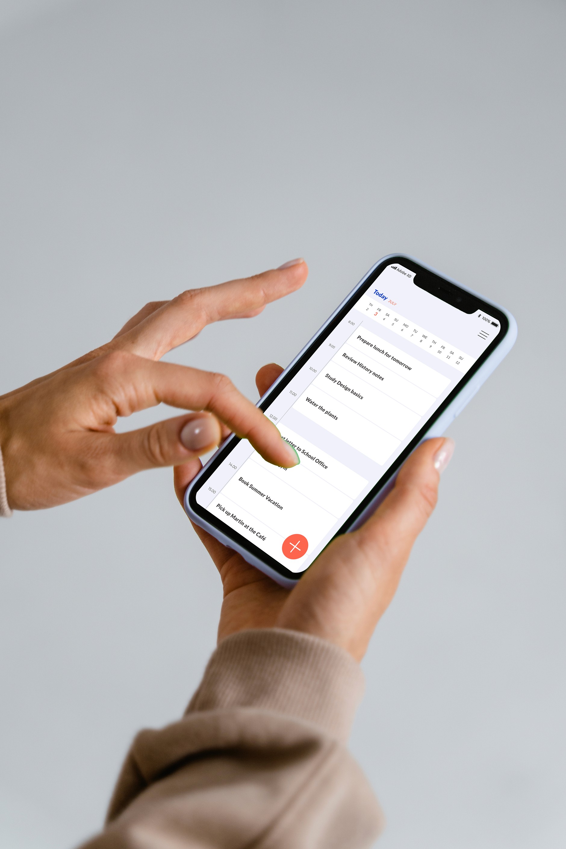
Final Design
What went well?
Selecting a colour palette and choosing patterns to solve design challenges was easy.
What went wrong?
This was my first time using a design tool. I spent a lot of time aligning elements, and it took me a while to find the right typeface due to the numerous free options available. I also had trouble finding a beautiful and free illustration image. Since everything was new to me, I ended up taking more time than I had planned for each stage of the design process.
Final thoughts
For a first UI project, I'm quite proud of the result. However, if I were to redo this project, I would have conducted user research to gain a better understanding of the targeted audience's needs. Additionally, I would have tested my design with users throughout the project to ensure that it was created using a user-centric approach.