insPowr
insPowr is a platform where users can book coaching and mentoring sessions with professionals from various field. It also ohffers curated resources and self-assessments related to career, mental health
insPowr
insPowr is a platform where users can book coaching and mentoring sessions with professionals from various field. It also ohffers curated resources and self-assessments related to career, mental health
insPowr
insPowr is a platform where users can book coaching and mentoring sessions with professionals from various field. It also ohffers curated resources and self-assessments related to career, mental health


Role
UI Designer
Role
UI Designer
Role
UI Designer
Type
Native App
Type
Native App
Type
Native App
Duration
December 2023
Duration
December 2023
Duration
December 2023
Tools
Figma
Tools
Figma
Tools
Figma
Context
This project was created as part of my UI design course at Career Foundry. The instructions given were to design a iOS and Android native app that solves a specific user problem. The demand in the coaching and mentoring industry is growing. insPowr aims to be solution to this, that is engaging and easy to use.
Objective
inPowr offers the possibility to book coaching/mentoring sessions and offer related educational resources and self-assessments with a simple clean and straightforward layout.


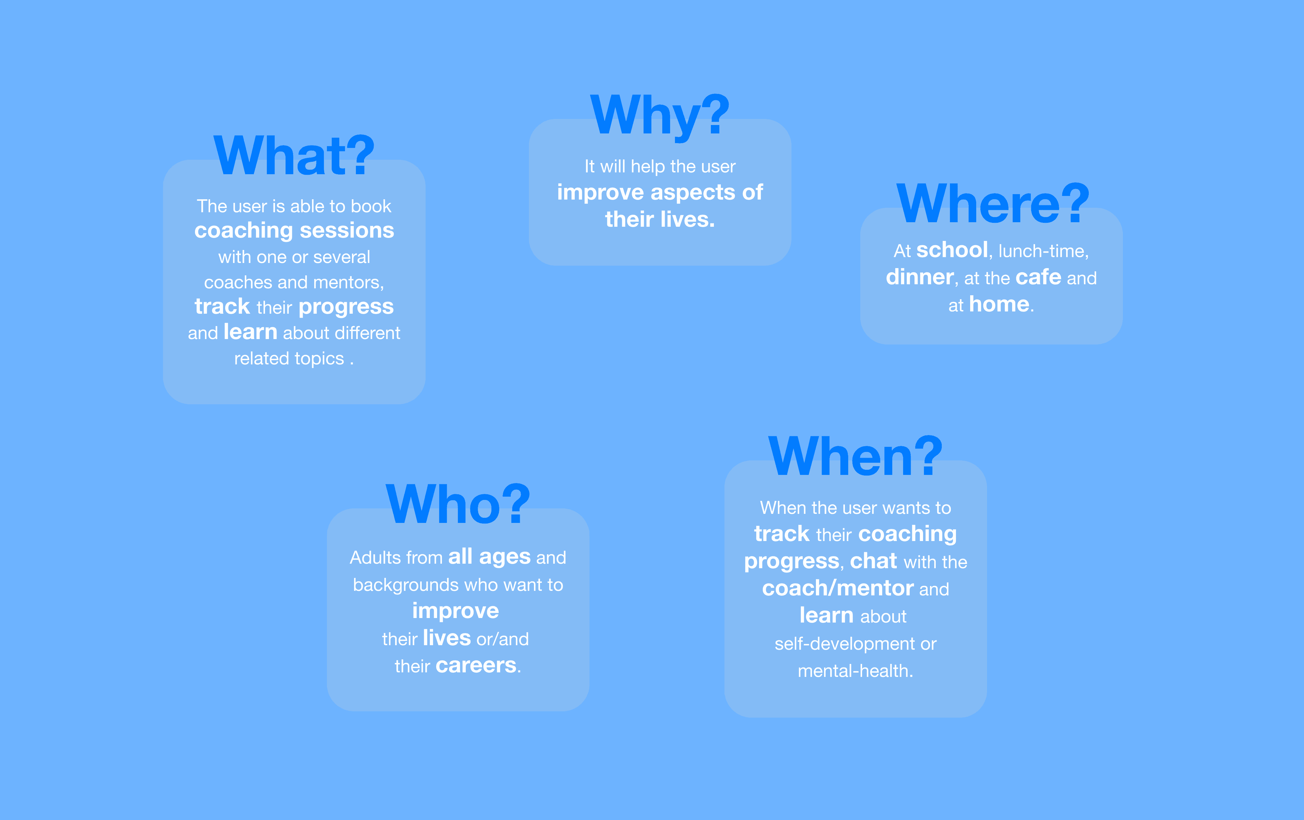
5 W's
This stage helped me define the Project Proposal, which included the Overview, Context, Objective and Key Features .
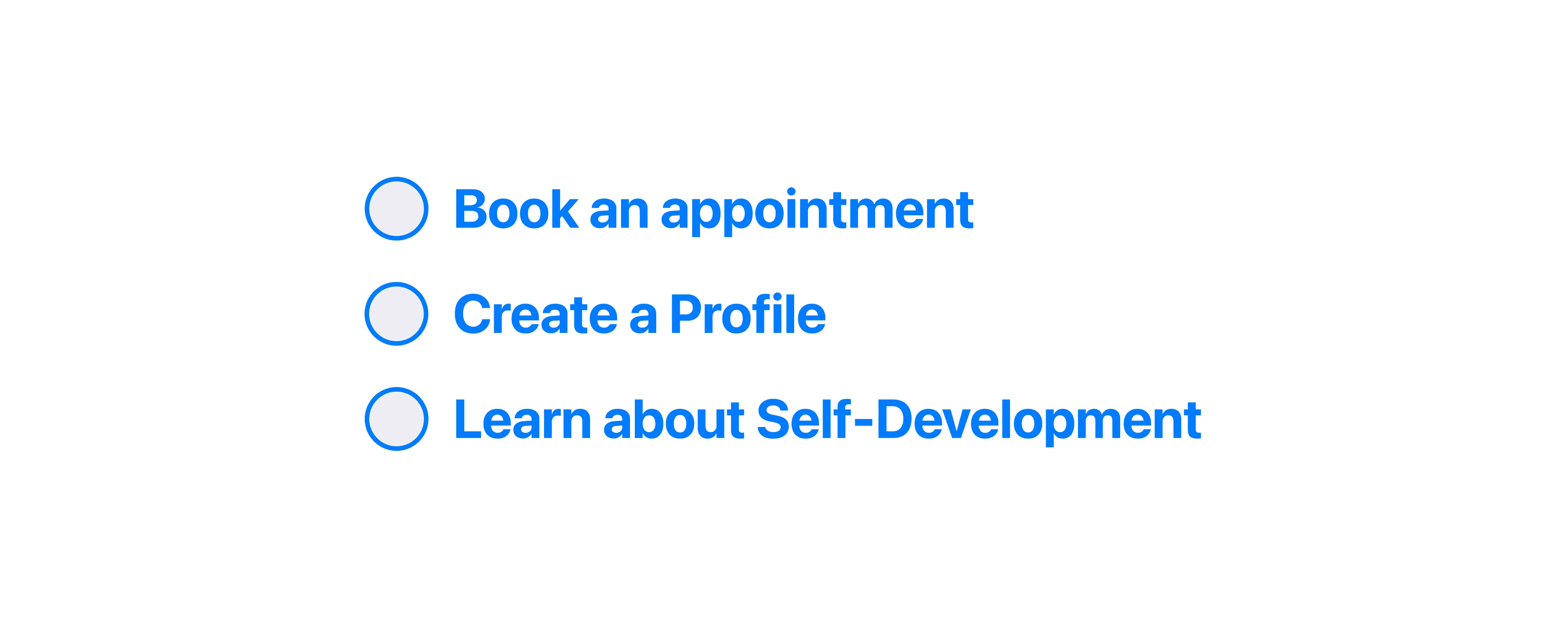
Key Features
The brief for this project required 3 key features. These were chosen so that the product was viable and matched the hypothetical business requirements.
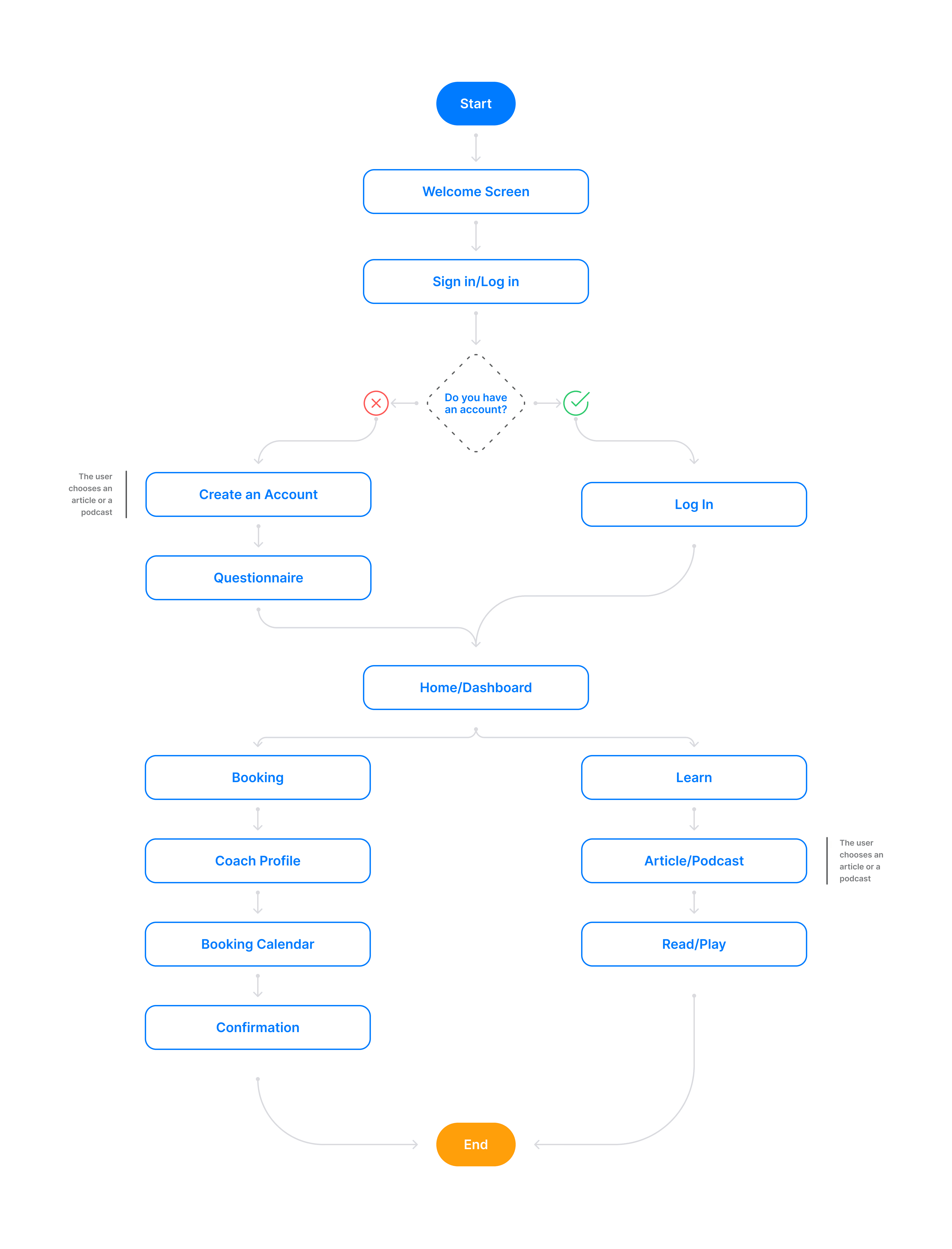
User Flow
A user flow was created to map each step the user needs to achieve their goal.
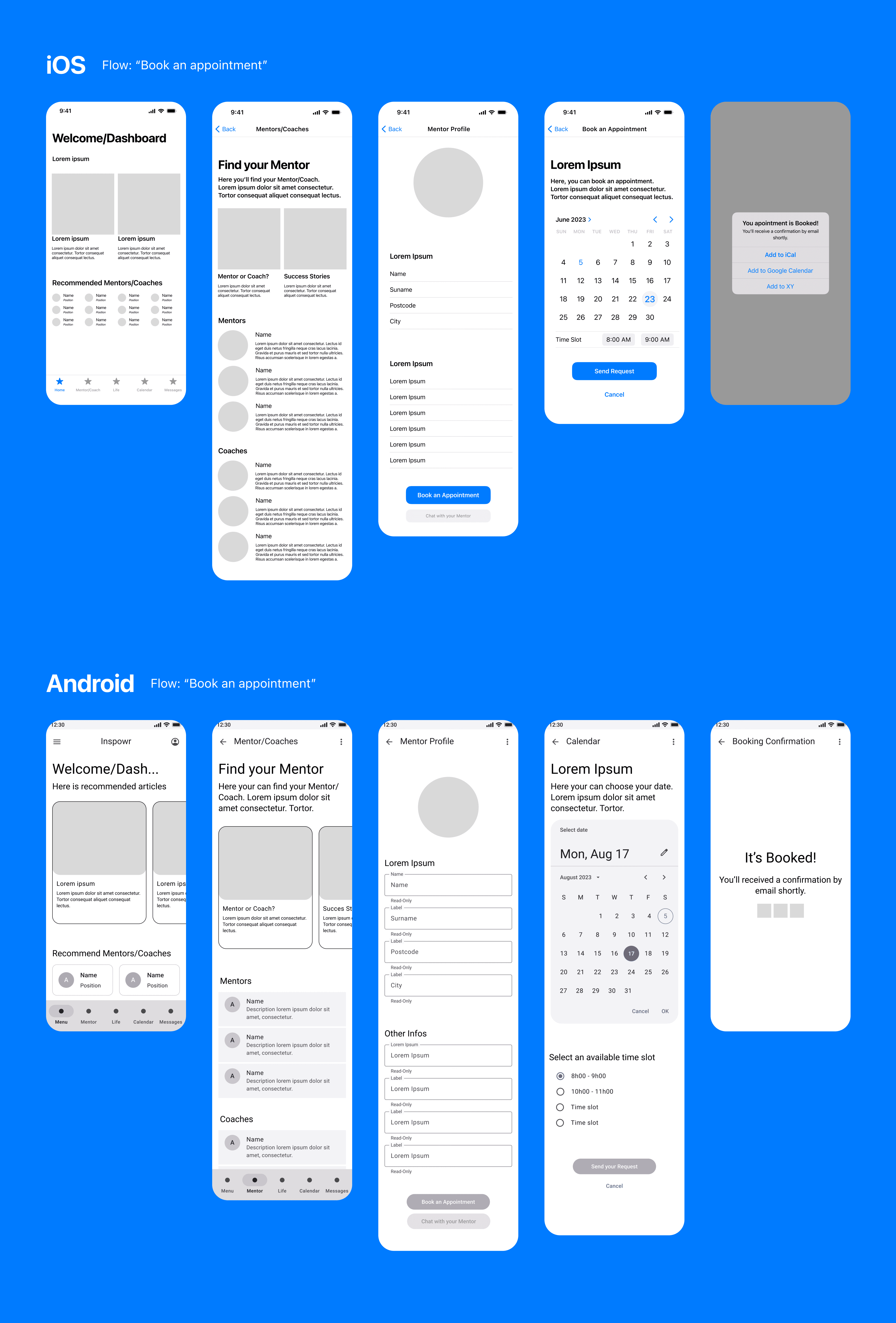
Low-Fidelity Wireframes
The low-fidelity wireframes were created using the IOS 17 and Material 3 Figma UI Kit. This helped me to learn about common patterns used for each operating system.
Competitor Analysis
A quick analysis of 3 competitors was done by navigating through each app.
Mid-Fidelity Wireframes
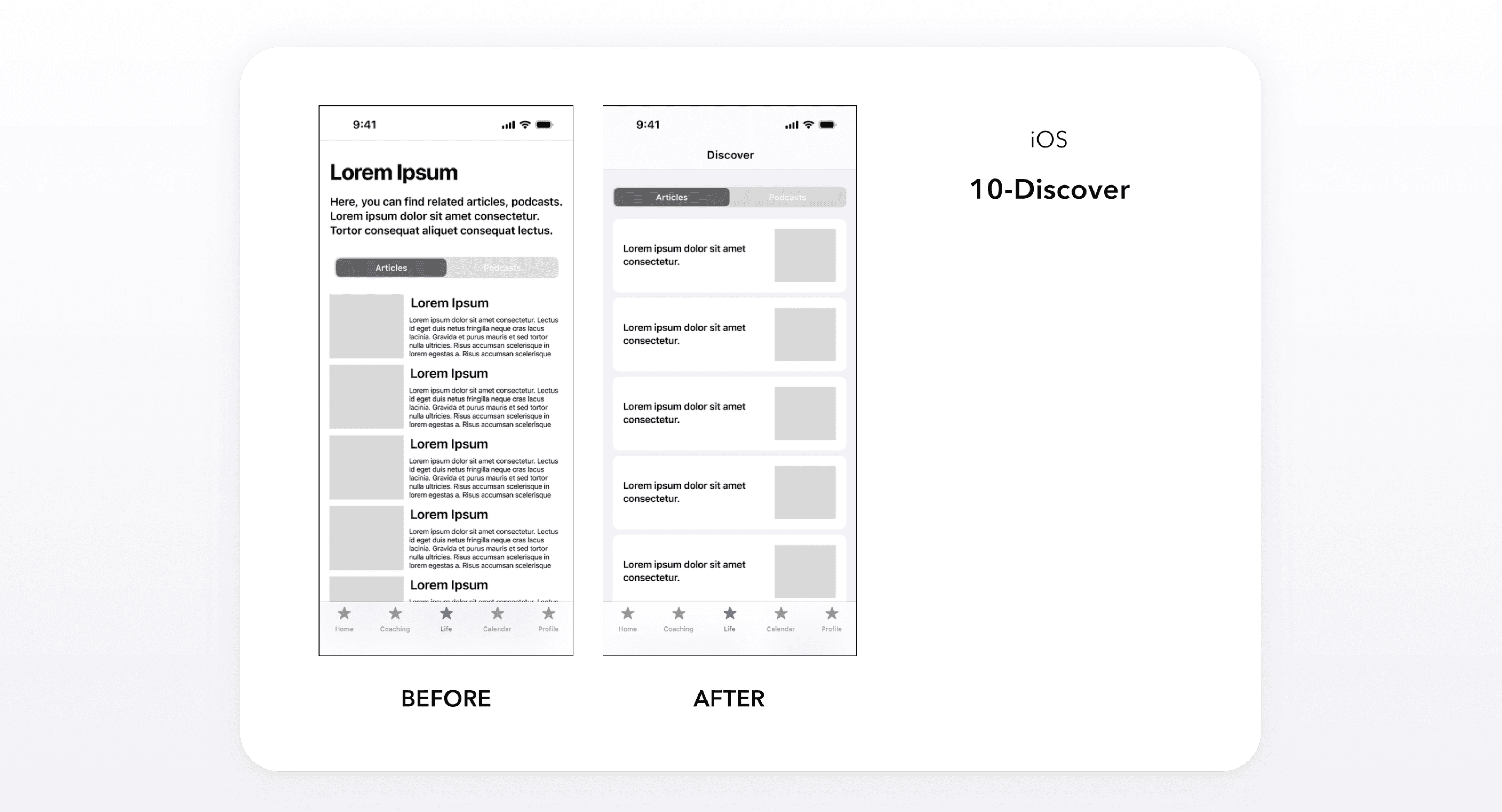
After the analysis, mid-fidelity wireframes were designed. The screens were shared across various Slack channels and feedback was collected. This allowed me to iterate the wireframes so that the design of the project remained user-centric.
Haptics, Sound
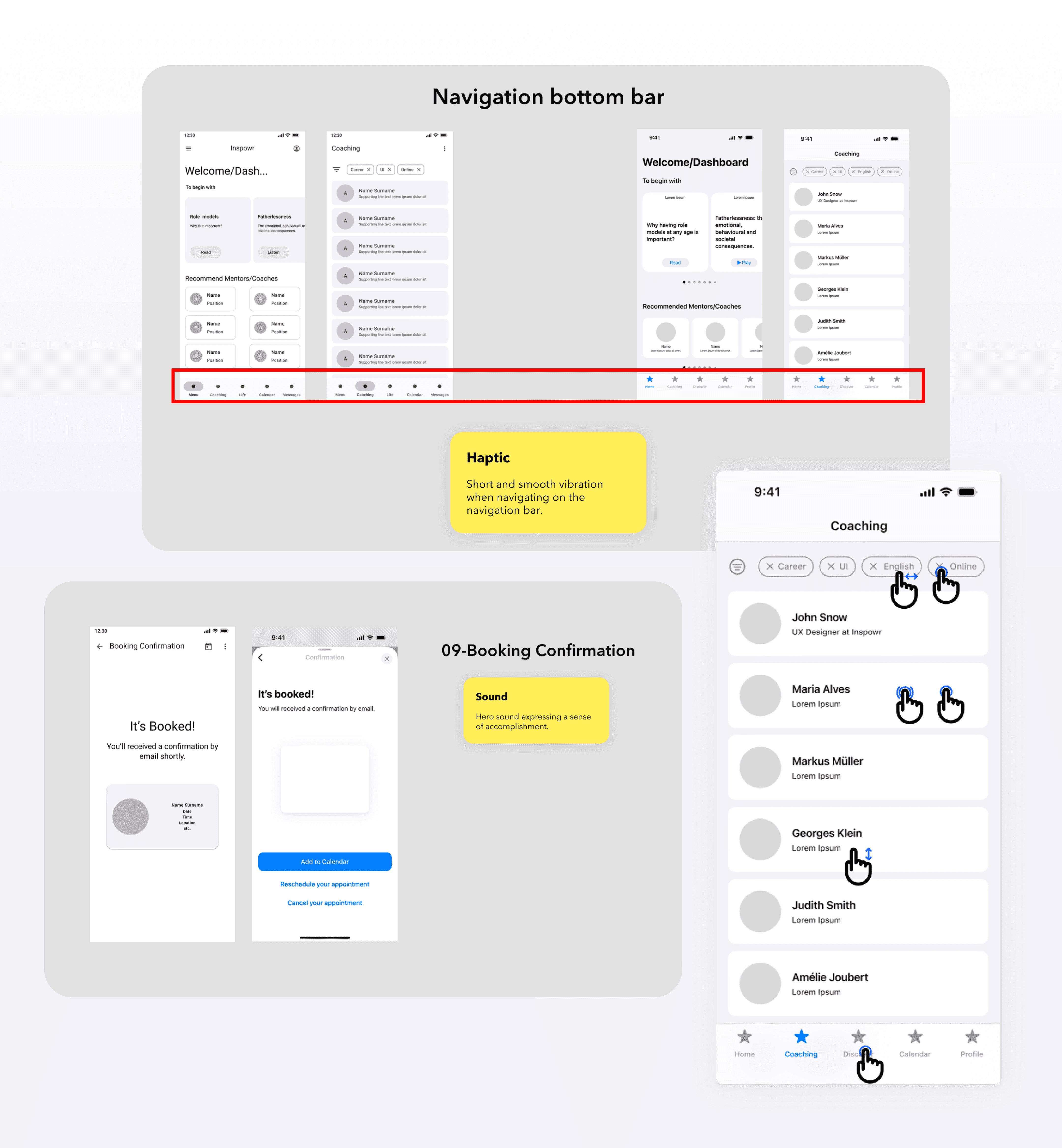
A first draft was created reflecting on physical feedback, sound, and gestures.
User Testing
After creating High-Fidelity Wireframes, a prototype for each operating system was created. These were submitted to 5 potential users for feedback.
Scenario & Tasks
“You've decided that you want to improve some areas in your life and want to have someone with experience to guide you in the process. You want to book a first call to have a first contact with the person you chose. You also want to learn more about self-development.”
Results

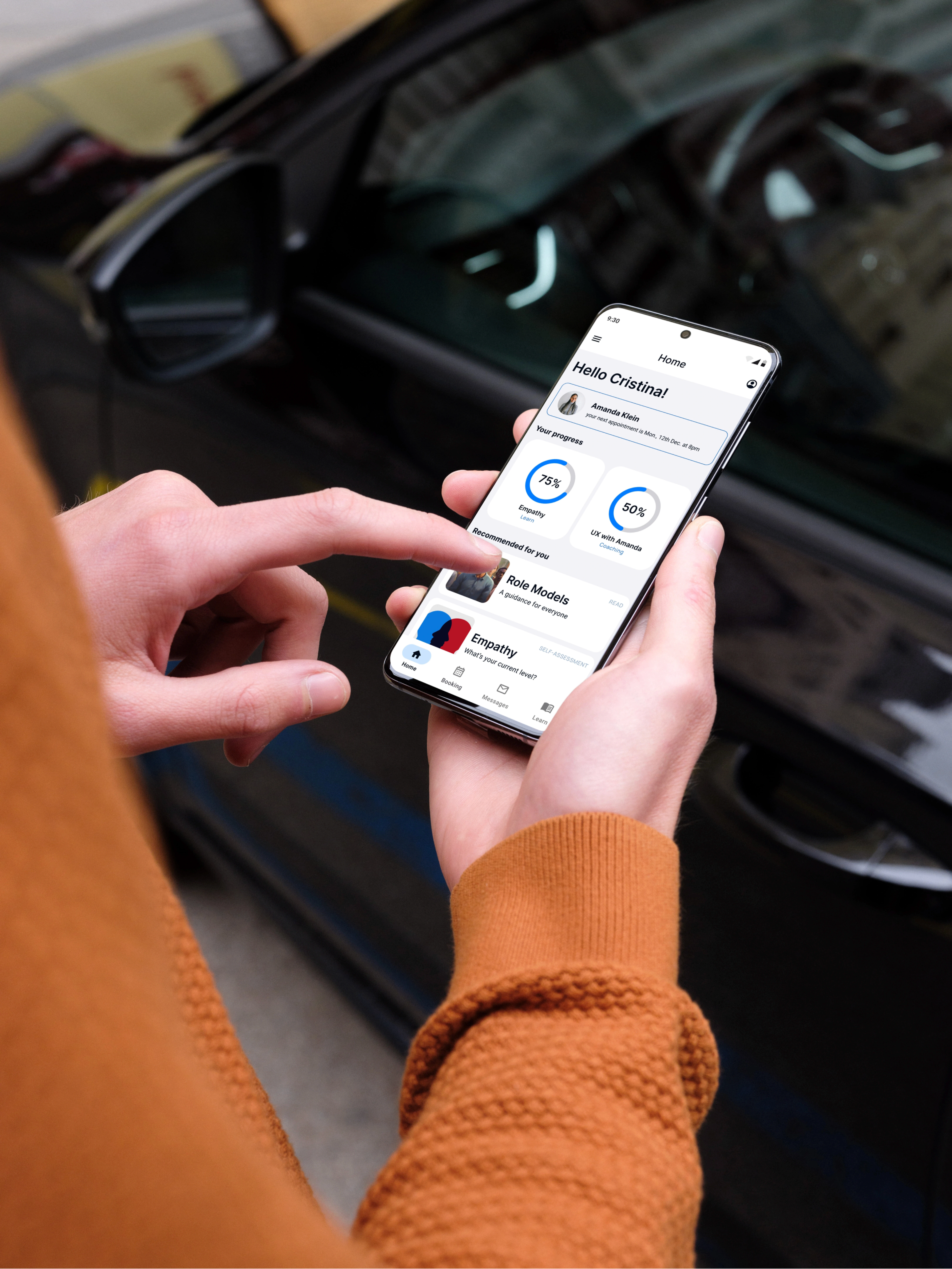
Home
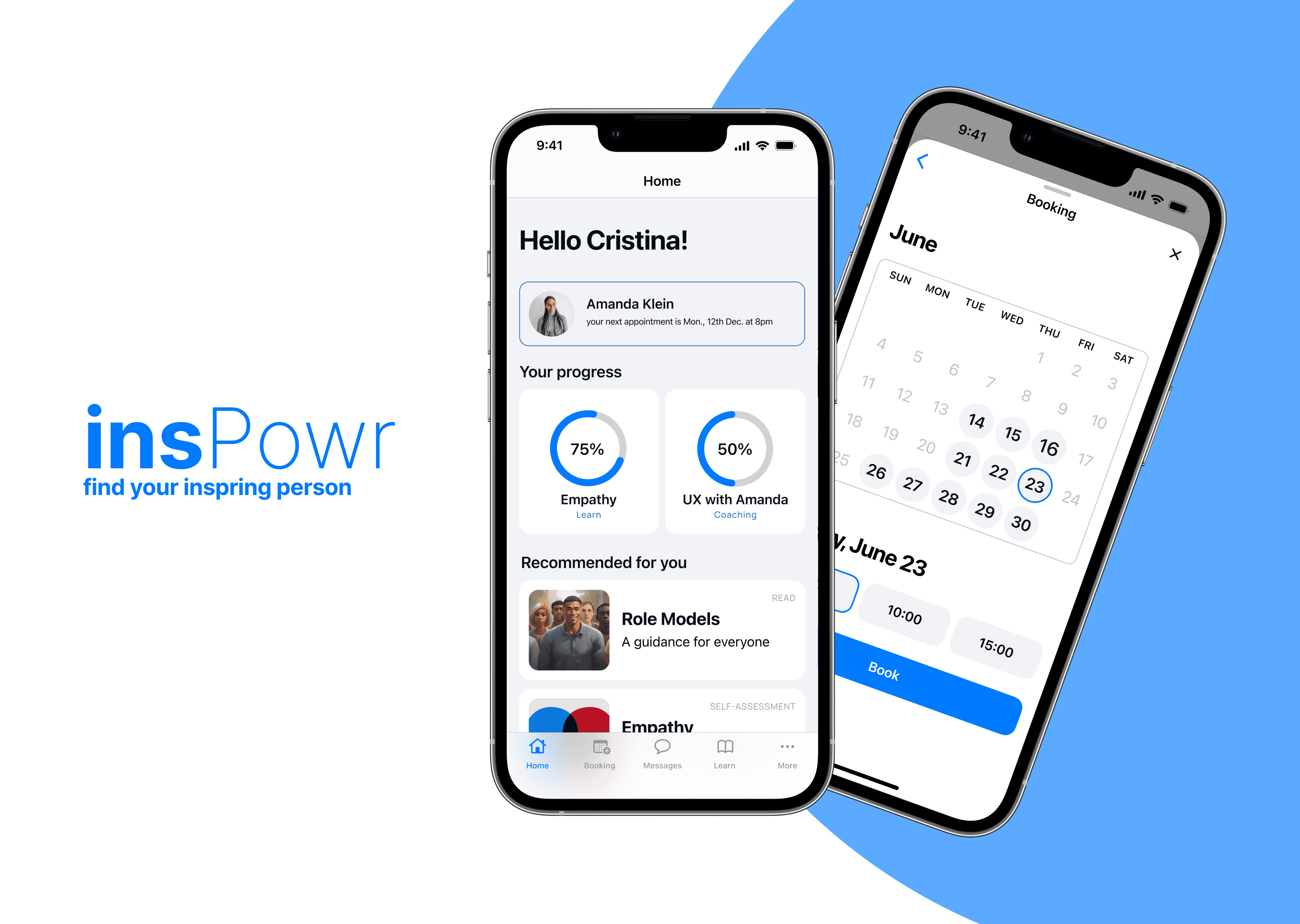
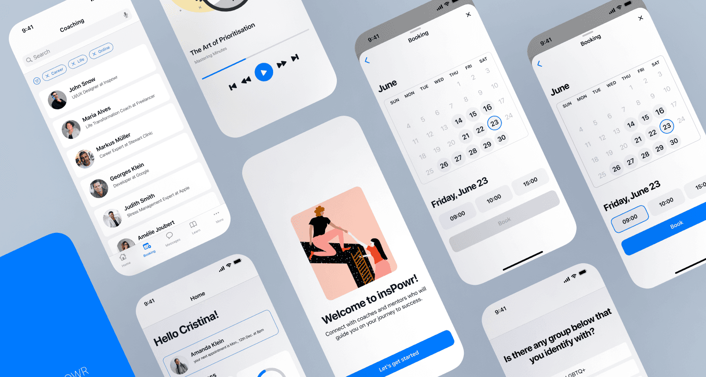
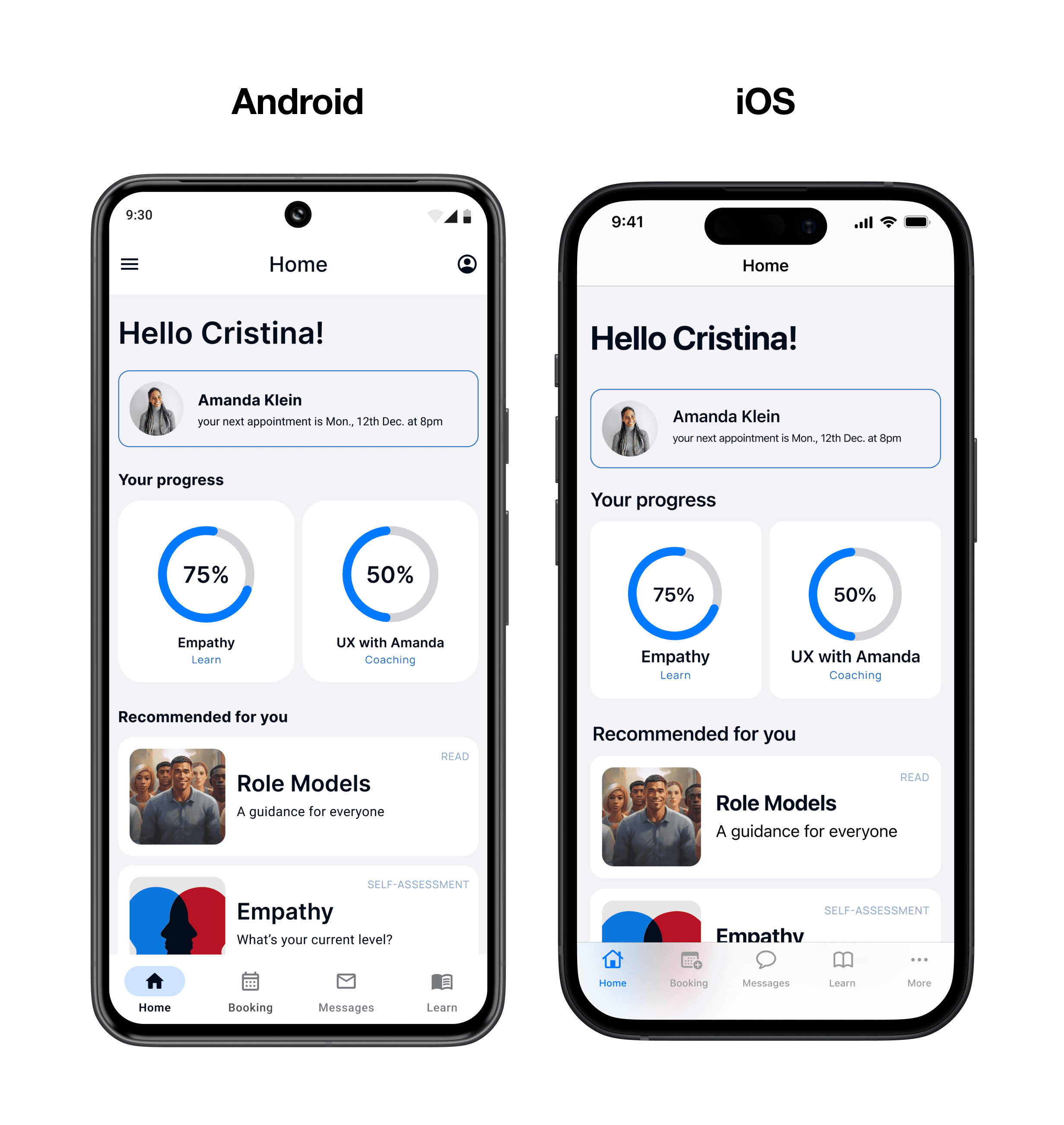
Clean layout with recommendations with key information such as next appointment and progress on skills and coaching.
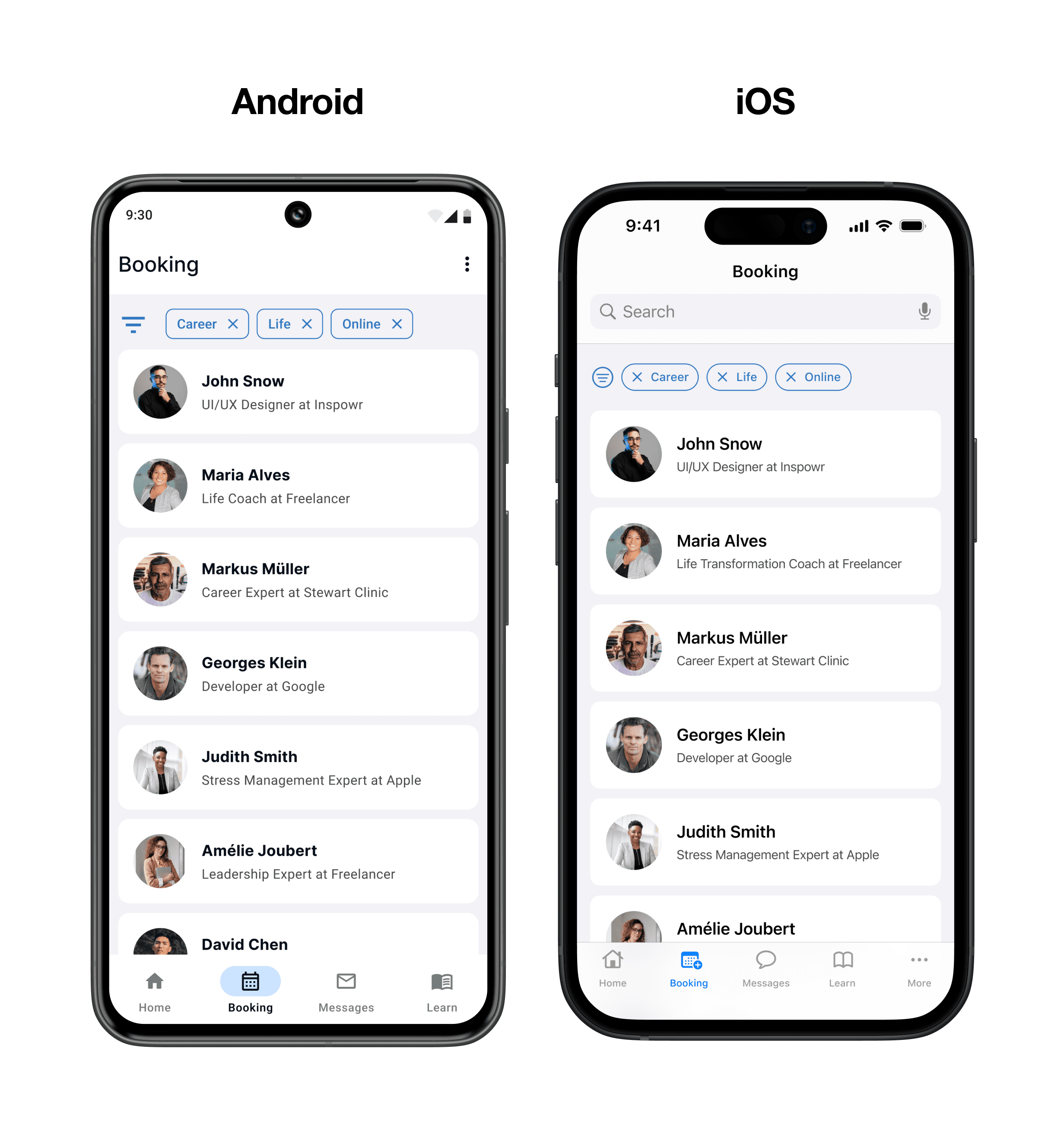
Booking
An extensive list of coaches and mentors and easy search filter.
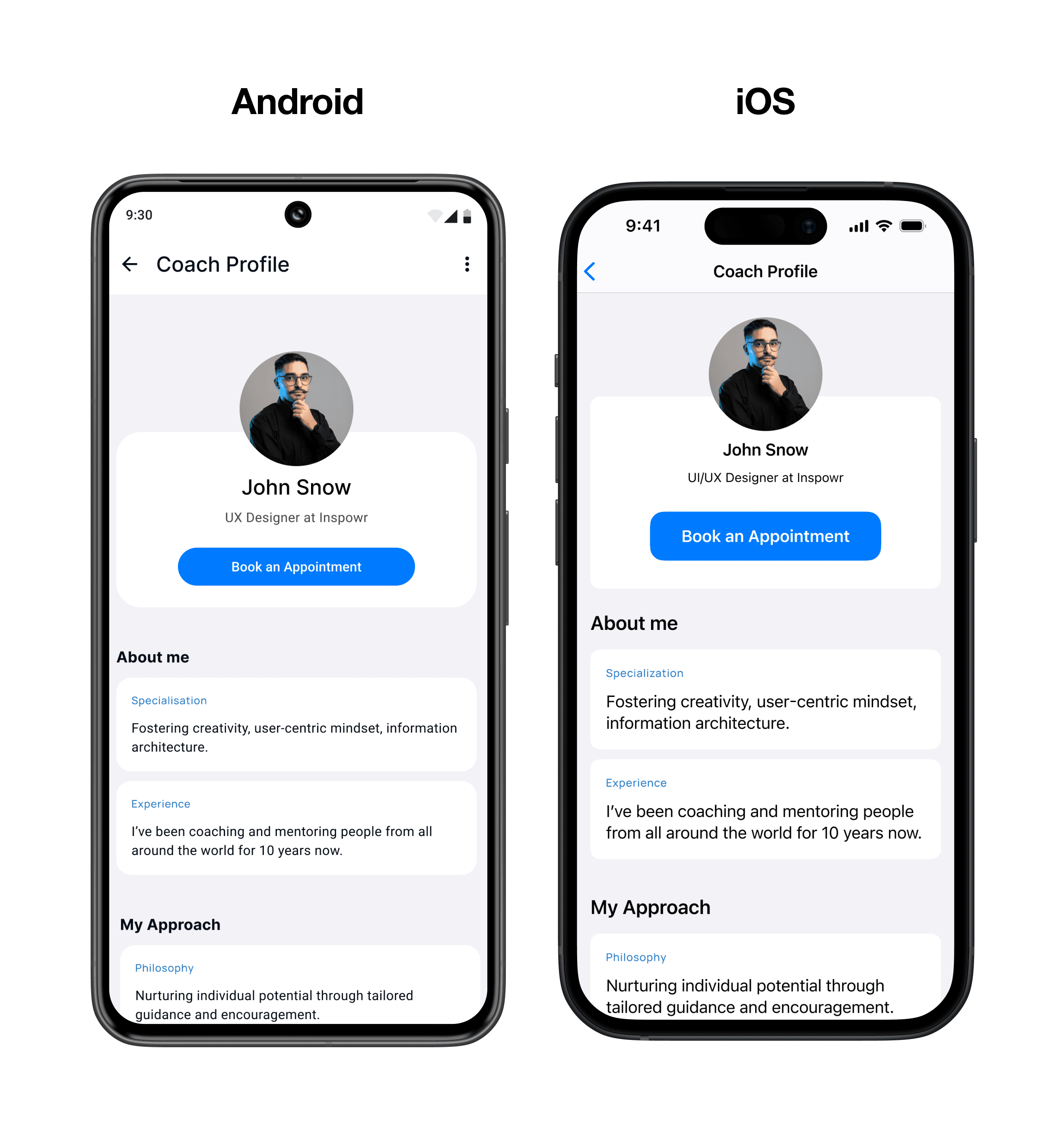
Coach Profile
Key details about the coach are displayed in a friendly and approachable way.
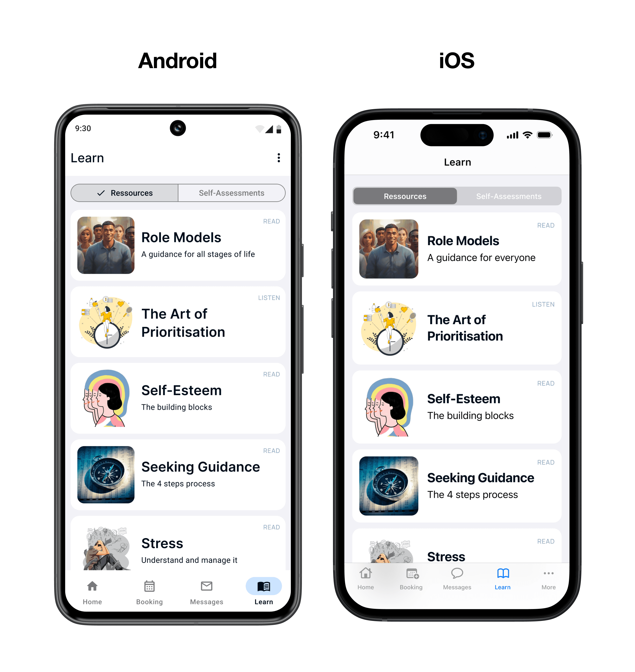
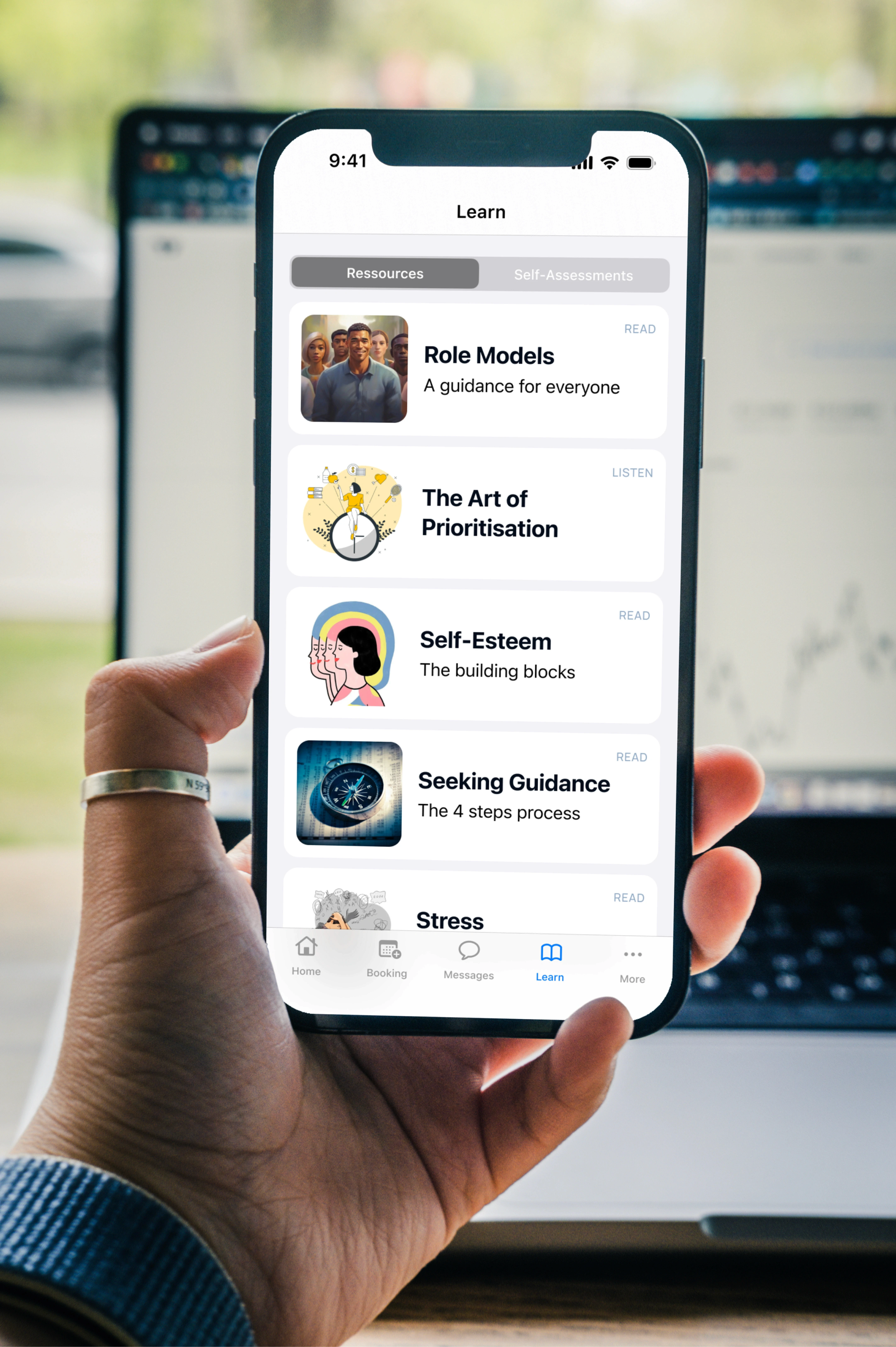
Learn
Library with educational resources and self-assessments where the user can learn about mental health and self-development topics.
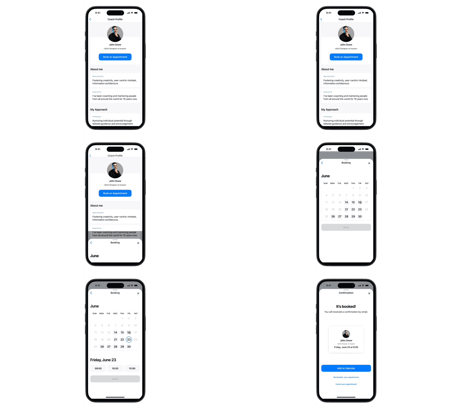
Book an Appointment
Each step is revealed individually so that the user is focused on one task. The “book” button, in a disabled state, reminds the user of the final goal.
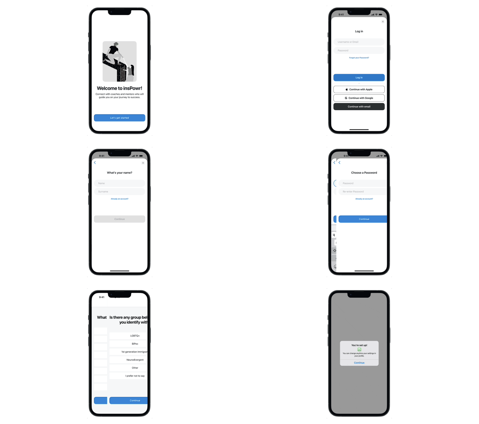
Create a Profile
Common patterns from each guideline were used and feedback so the user knows where they are at any time. A questionnaire is offered to the user to create a tailored experience in the app.
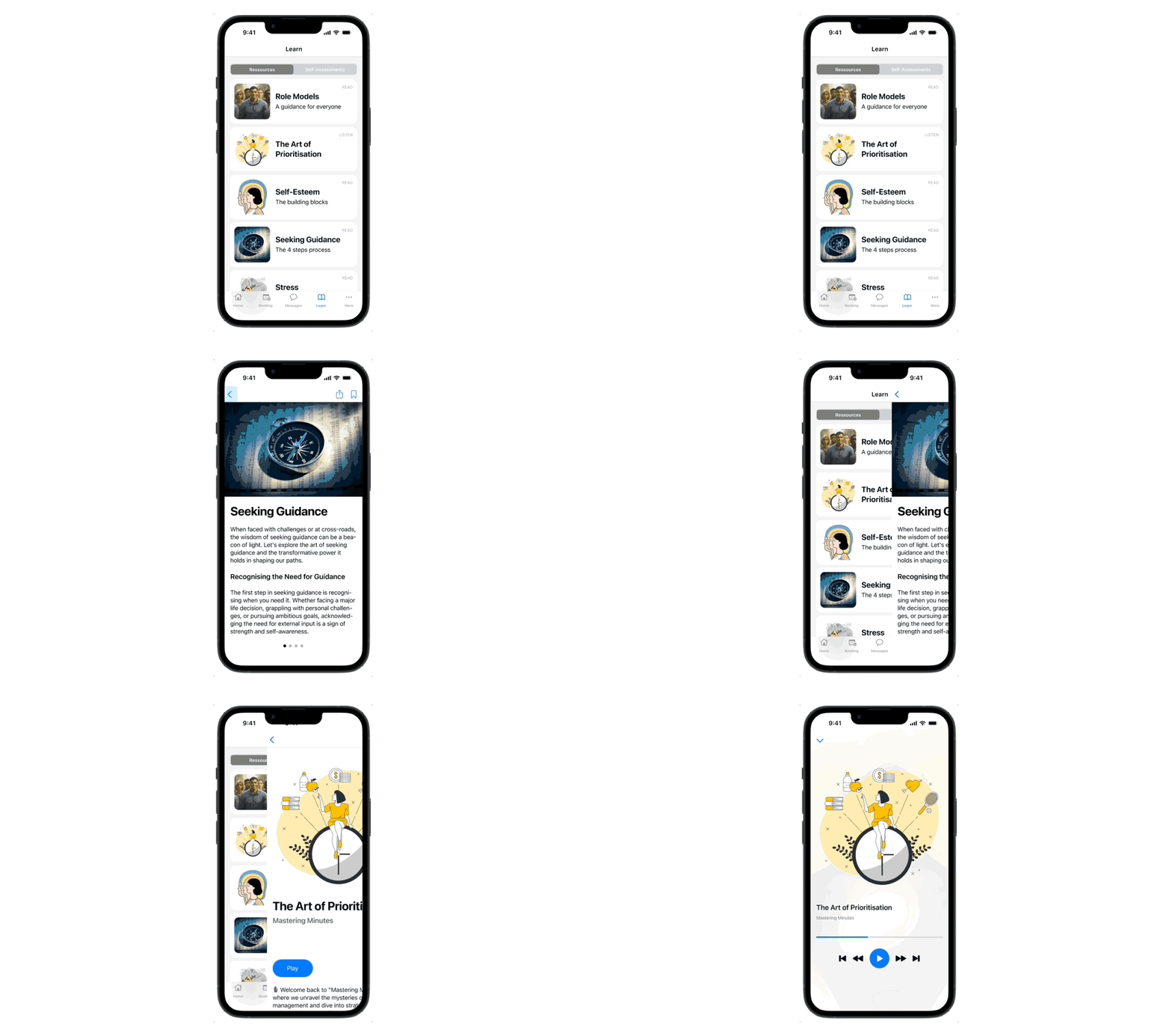
Learn About Self-development
Whether by listening to a podcast, reading an article or doing a self-assessment, the user has a range of options to learn about themselves and discover any area of improvement.
5 W's
This stage helped me define the Project Proposal, which included the Overview, Context, Objective and Key Features .

Key Features
The brief for this project required 3 key features. These were chosen so that the product was viable and matched the hypothetical business requirements.

User Flow
A user flow was created to map each step the user needs to achieve their goal.

Low-Fidelity Wireframes
The low-fidelity wireframes were created using the IOS 17 and Material 3 Figma UI Kit. This helped me to learn about common patterns used for each operating system.

Competitor Analysis
A quick analysis of 3 competitors was done by navigating through each app.

Mid-Fidelity Wireframes
After the analysis, mid-fidelity wireframes were designed. The screens were shared across various Slack channels and feedback was collected. This allowed me to iterate the wireframes so that the design of the project remained user-centric.

Haptics, Sound
A first draft was created reflecting on physical feedback, sound, and gestures.

User Testing
After creating High-Fidelity Wireframes, a prototype for each operating system was created. These were submitted to 5 potential users for feedback.
Scenario & Tasks
“You've decided that you want to improve some areas in your life and want to have someone with experience to guide you in the process. You want to book a first call to have a first contact with the person you chose. You also want to learn more about self-development.”
Results

Home
Clean layout with recommendations with key information such as next appointment and progress on skills and coaching.

Booking
An extensive list of coaches and mentors and easy search filter.

Coach Profile
Key details about the coach are displayed in a friendly and approachable way.

Learn
Library with educational resources and self-assessments where the user can learn about mental health and self-development topics.

Book an Appointment
Each step is revealed individually so that the user is focused on one task. The “book” button, in a disabled state, reminds the user of the final goal.

Create a Profile
Common patterns from each guideline were used and feedback so the user knows where they are at any time. A questionnaire is offered to the user to create a tailored experience in the app.

Learn About Self-development
Whether by listening to a podcast, reading an article or doing a self-assessment, the user has a range of options to learn about themselves and discover any area of improvement.

5 W's
This stage helped me define the Project Proposal, which included the Overview, Context, Objective and Key Features .

Key Features
The brief for this project required 3 key features. These were chosen so that the product was viable and matched the hypothetical business requirements.

User Flow
A user flow was created to map each step the user needs to achieve their goal.

Low-Fidelity Wireframes
The low-fidelity wireframes were created using the IOS 17 and Material 3 Figma UI Kit. This helped me to learn about common patterns used for each operating system.

Competitor Analysis
A quick analysis of 3 competitors was done by navigating through each app.

Mid-Fidelity Wireframes
After the analysis, mid-fidelity wireframes were designed. The screens were shared across various Slack channels and feedback was collected. This allowed me to iterate the wireframes so that the design of the project remained user-centric.

Haptics, Sound
A first draft was created reflecting on physical feedback, sound, and gestures.

User Testing
After creating High-Fidelity Wireframes, a prototype for each operating system was created. These were submitted to 5 potential users for feedback.
Scenario & Tasks
“You've decided that you want to improve some areas in your life and want to have someone with experience to guide you in the process. You want to book a first call to have a first contact with the person you chose. You also want to learn more about self-development.”
Results

Home
Clean layout with recommendations with key information such as next appointment and progress on skills and coaching.

Booking
An extensive list of coaches and mentors and easy search filter.

Coach Profile
Key details about the coach are displayed in a friendly and approachable way.

Learn
Library with educational resources and self-assessments where the user can learn about mental health and self-development topics.

Book an Appointment
Each step is revealed individually so that the user is focused on one task. The “book” button, in a disabled state, reminds the user of the final goal.

Create a Profile
Common patterns from each guideline were used and feedback so the user knows where they are at any time. A questionnaire is offered to the user to create a tailored experience in the app.

Learn About Self-development
Whether by listening to a podcast, reading an article or doing a self-assessment, the user has a range of options to learn about themselves and discover any area of improvement.






What went well?
The easiest part was to come up with the idea. I was inspired by what was naturally interested in, and it was easy to find patterns to solve the problems stated at the beginning of the project.
What went wrong?
It wasn't easy to have a clear understanding of the guidelines and to be creative while respecting them. Also, if time had allowed, I would have conducted interviews with potential users, so that I would have created a product that is as much user centric as possible.
Future Steps
I want to carry out more user testing with this project to identify any pain points, do tests with a different colour palette and research if and how a volunteering system and low-income offer could be integrated into this product so that it is more inclusive. Also, I will allocate some time to review Material and Human Interface guidelines.
Final thoughts
Overall, I am quite proud of my project. Although I wish I were a bit more creative in some areas such as the colour palette and some shapes, I’m quite happy to have a product that is straightforward minimalist and appealing.
